A PERT chart is used to schedule the tasks required to complete a project, and to estimate the minimum time required. In a PERT chart the tasks required to complete the project are typically shown as boxes and dependencies between tasks (e.g. Task A must be done before Task B starts) are shown as arrows. You can easily create PERT charts on your Windows or Mac computer using Hyper Plan. Hyper Plan is inexpensive and much more powerful than a PERT chart template or generic drawing software. It can also calculate the total effort and critical path for you.
 PERT Chart Diagram example
This page will take you through how to create a PERT chart from scratch in Hyper Plan. If you would rather download one that has already been created, please go to our PERT chart example page.
If you haven’t already got Hyper Plan installed, you can download a free trial here. It should only take you a minute to download and install. When you are prompted which edition of Hyper Plan to try, choose Professional Edition (dependencies between cards are not available in the Home edition). If you are already using the Home edition, you can switch to a trial of the Professional edition in the Edition tab of the Preferences window.
Start Hyper Plan. Create a new file by selecting File>New. Choose a name for the new plan file, e.g. “PERT chart”.
In the New Plan Properties window leave the Title property checked. Click the Add Property button and add a new property Effort with Type set to Numeric and Display as set to Card text.
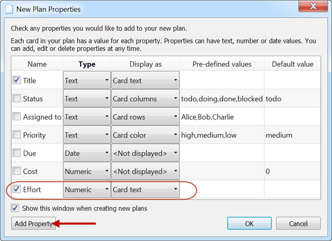
Click OK.
Now we can add a card for the first task. Click on the Add Card toolbar button, fill out the card as below and click OK.
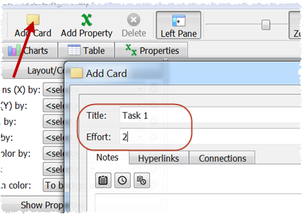
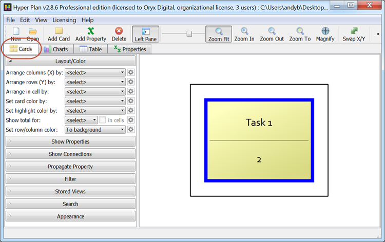
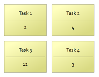
This card represents a task that we estimate will take 2 days to complete. The card title is “Task 1” for this example, but you would use something more descriptive in a real project plan. A single card should now be visible in the Cards pane.
Add 3 more cards, as shown below.
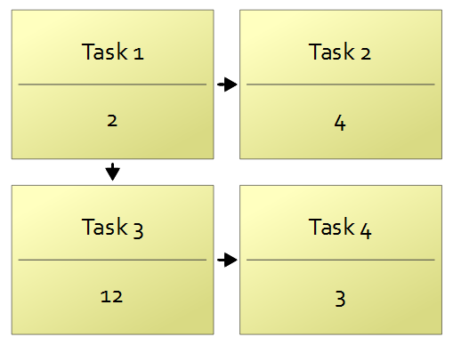
We now want to show that “Task 1” is a predecessor of “Task 2” (i.e. “Task 1” has to be completed before “Task 2” begins). Hold down the Shift key, click on “Task 1”, drag to “Task 2” and release. Select Before from the menu that appears.
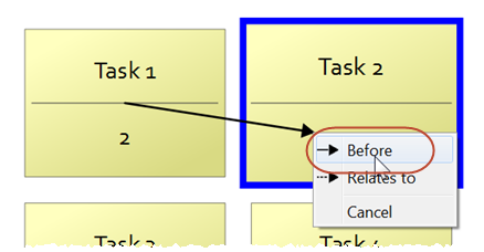
Add predecessor arrows in the same way from “Task 1” to “Task 3” and “Task 3” to “Task 4”.
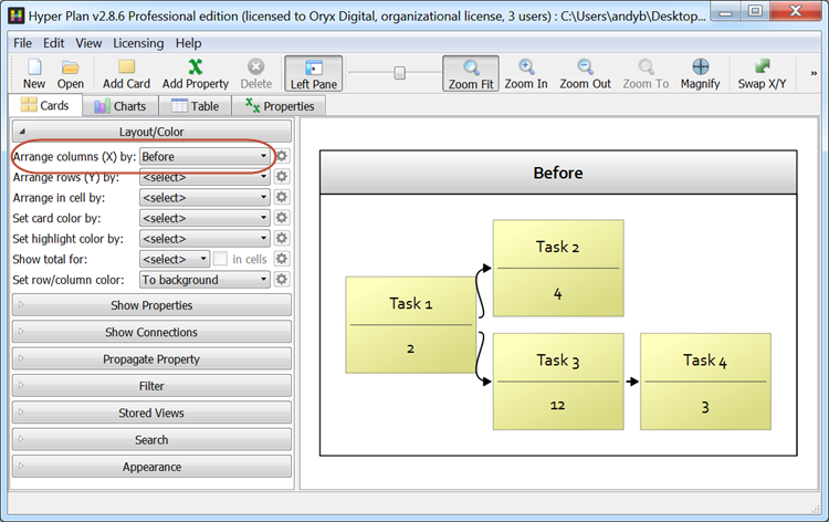
Select Before from Arrange columns (X) by to layout the tasks automatically by their connectivity. This automatic layout can save you a lot of time with large projects.
Set the Propagate Property section of the left pane as below.
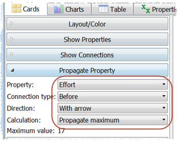
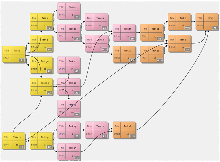
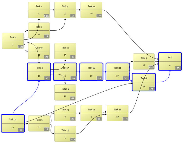
Propagate maximum means that the time required to complete each task is the effort for that task plus the maximum time from amongst its predecessors. This is the standard approach for a PERT chart. The total days to complete each task and its predecessors is now shown on the tasks.
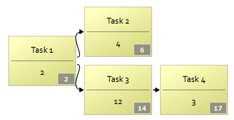
This means it is going to take us 17 days to complete Task 4 and all its predecessors. Now add a “Before” arrow from “Task 2” to “Task 4”.
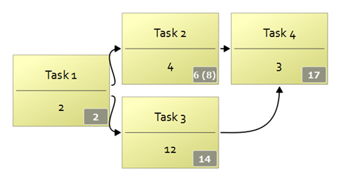
The “6 (8)” for “Task 2” means that Task 2 will take 6 days from the project start to complete and there will then be 8 days of ‘slack’ (also called ‘float’) on this task. In other words, “Task 2” can be started up to 8 days after “Task 1” is completed, without affecting the minimum time to complete the project.
Now add some more tasks and predecessor connections. Choose any values for Title and Effort and add “Before” connections as you please. But make sure you don’t create any ‘cycles’ (cards that connect back to themselves) as this isn’t permitted in a PERT chart. To delete a connection, select the connection and select Edit>Delete. Connect all the final tasks (those that are not a predecessor to any other) to a task called “End” with effort 0.
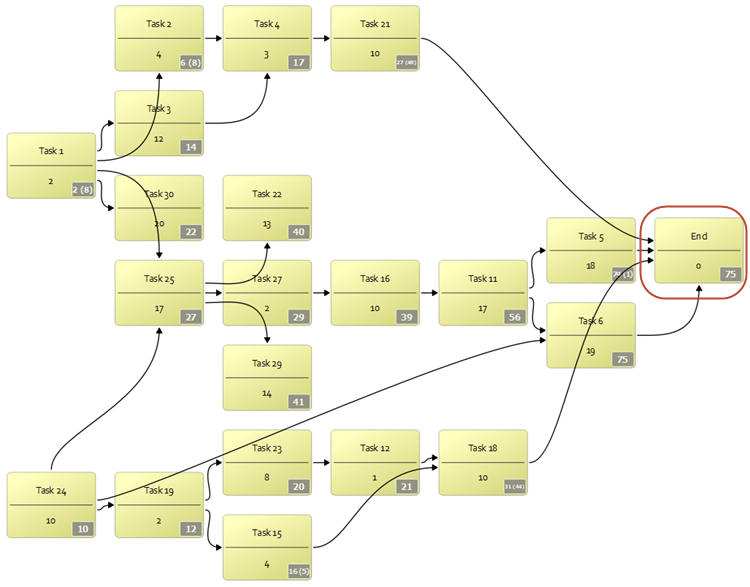
Now right-click on the “End” task and choose Select critical path(s).
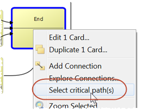
The critical path(s) will now be selected. This shows the tasks that will delay the end of the project if they take longer than estimated (i.e. have no slack/float).
As the project progresses you can change the “effort” value for each task to show the estimated effort remaining.
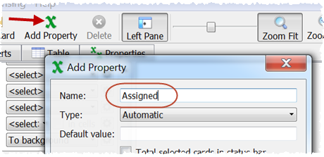
We can add any number of properties to our PERT chart. Click on the Add Property button and create a new property called “Assigned”.
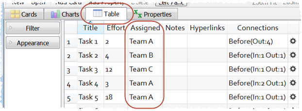
Now go to the Table pane and fill in some of the assigned column cells with the name of the team that is assigned to that task. E.g. Team A, Team B, Team C.
Return to the Cards pane and set Set card color by to Assigned. The tasks are now colored by the team assigned.
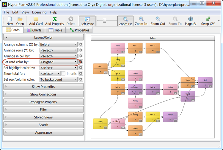
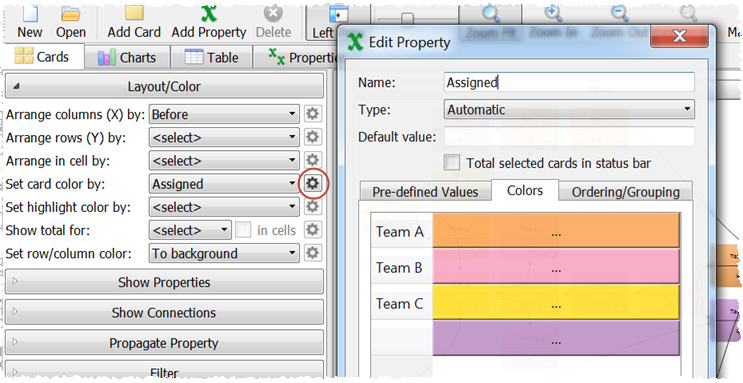
Click on the cog button to change the colors.
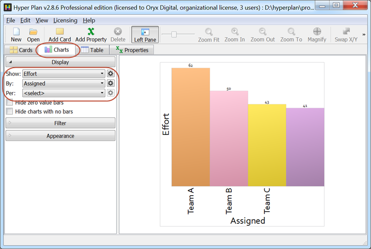
Go to the Charts pane and set the Display values as below to show a chart of the total effort by team.
We could add another property for “status” so that we can color code tasks according to whether they are not started, partially complete or complete. We can also add additional properties for optimistic and pessimistic effort estimates so we can analyze optimistic and pessimistic schedules.
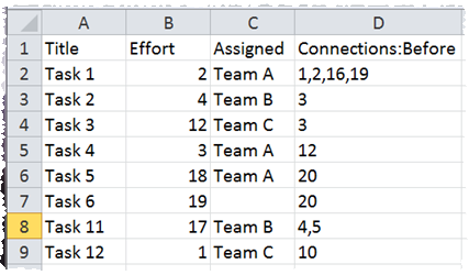
If you have your task information in a CSV file, you can import it so that you don’t have to re-type everything. Just select File>Open and set the file type to CSV Files. Note that you can File>Save As… from Microsoft Excel to create a CSV file.
Once you are happy with your PERT chart you can File>Print… or File>Export it.
Hyper Plan is very flexible. We have only scratched the surface of what it can do. Have a play!