 Example PERT chart
PERT charts were invented in the 1950’s to help manage complex projects. A PERT chart typically shows tasks as boxes and dependencies between tasks (e.g. Task A must be done before Task B starts) as arrows. Here we show you an example PERT chart that has been created in Hyper Plan, an inexpensive planning tool for Windows and Mac. Hyper Plan is much more powerful than a PERT chart template or generic drawing software. It can also calculate the total effort and critical paths for you.
You will need to install Hyper Plan to load the example. If you haven’t already got Hyper Plan installed, you can download a free trial here. It should only take you a minute to download and install. When you are prompted which edition of Hyper Plan to try, choose Professional Edition (dependencies between cards are not available in the Home edition). If you are already using the Home edition, you can switch to a trial of the Professional edition in the Edition tab of the Preferences window.
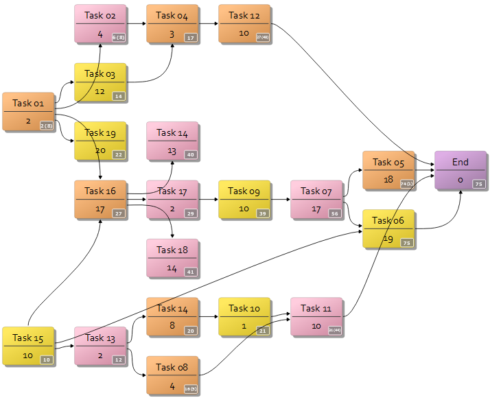
Download this Hyper Plan PERT chart example onto your computer and unzip it. Start Hyper Plan. If the Getting Started window appears select Open a sample plan, otherwise select File>Open from the main menu. Select the downloaded plan file (which is probably in your ‘Downloads’ folder). It should look something like this:
Each of the cards shows the name of the task and the estimated effort to complete it (a real plan would have more descriptive titles). The arrows show the sequence in which tasks must be completed (e.g. “Task 01” must be completed before “Task 02”). The number in the gray rectangle is the time required to complete that task and all it’s predecessor tasks, which is calculated automatically (with the ‘slack’/’float’ shown in brackets). Try changing the effort of a task and see what happens.
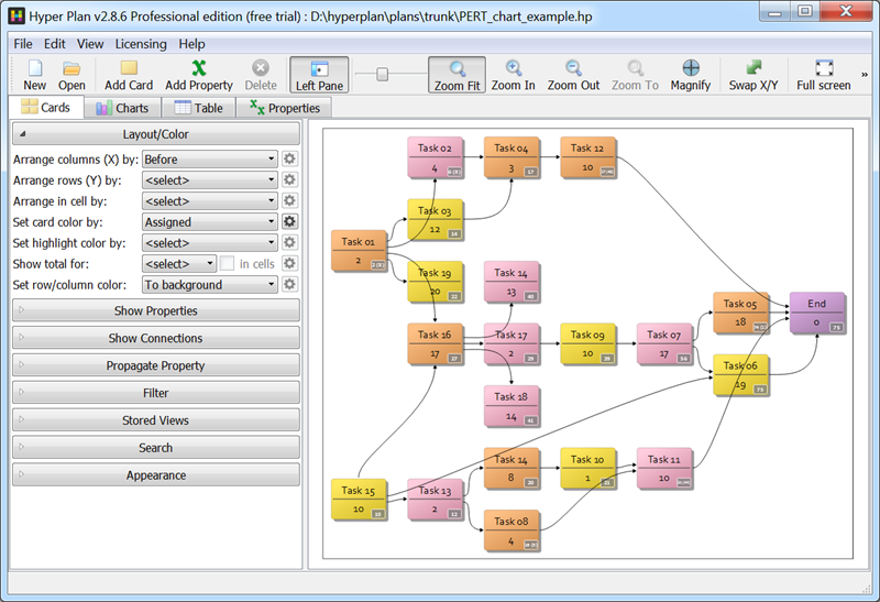
Right click on the “End’ task and choose Select critical path(s) to show the critical path to this task (the path to this card with no ‘slack’/’float’).
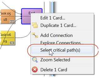
From the Stored Views section choose PERT colored by effort. This will show an alternative view with the tasks colored according to the estimated effort. Try changing the effort of a task and see the color change.
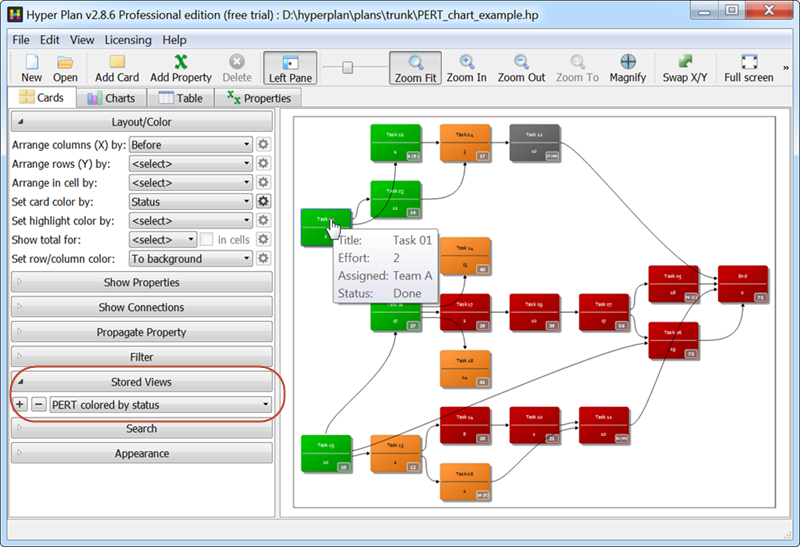
Now from the Stored Views section choose PERT colored by status. The tasks are now colored according to their status (To Do/Doing/Done/Blocked). Hover over a card for more details. Double-click on a card to edit the status.
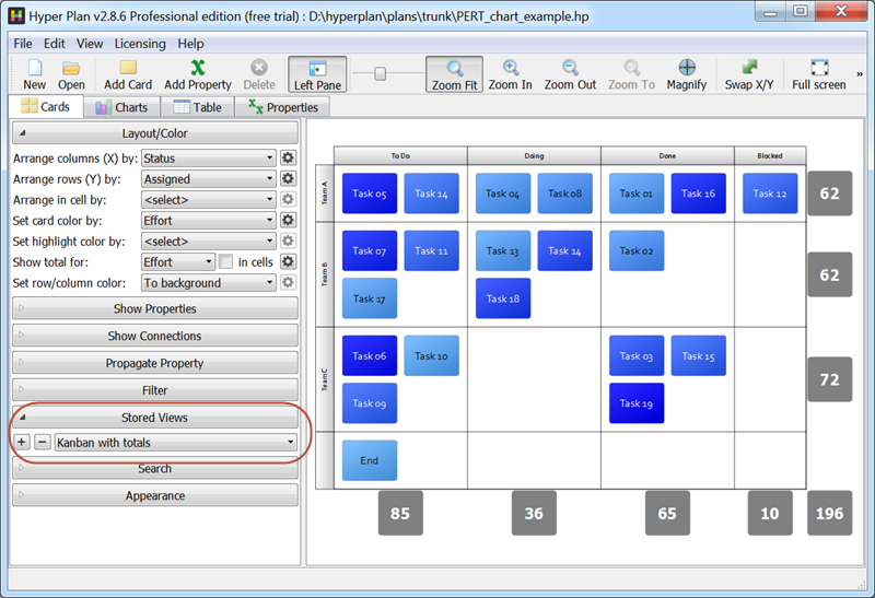
We aren’t restricted to just a PERT chart. From the Stored Views section choose Kanban with totals. The tasks are now laid out in a Kanban grid and colored according to their estimated effort. The total estimated effort for each row and column is also shown.
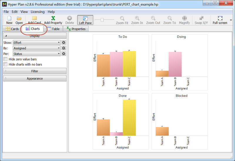
If you click on the Charts pane you can see charts of the total effort by status per team. These update automatically if you edit any of the tasks.
If you click on the Table pane you will see the tasks in a table, with the rows colored by task status. If you edit any of the values, the other panes will be updated. Try it.

Hyper Plan is very flexible. We have only scratched the surface of what it is capable of. To find out more about how to create your own PERT chart from scratch, please see: How to create a PERT chart.