A Risk Assessment Matrix (also known as a Risk Probability Impact Matrix, Risk PI Matrix or P-I Matrix) is a useful way to visualize and manage risk. It works by categorizing risks by how likely they are to occur and the amount of damage that would occur if they did.
You can easily create a Risk Assessment Matrix on your Windows or Mac computer using Hyper Plan software. Hyper Plan is inexpensive and much more powerful than a Risk Assessment Matrix template or generic drawing software. It automatically resizes your matrix as you add risks.
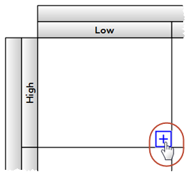
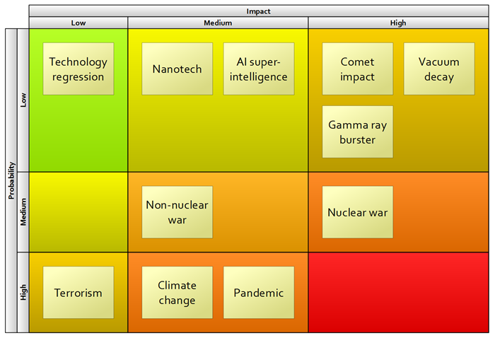
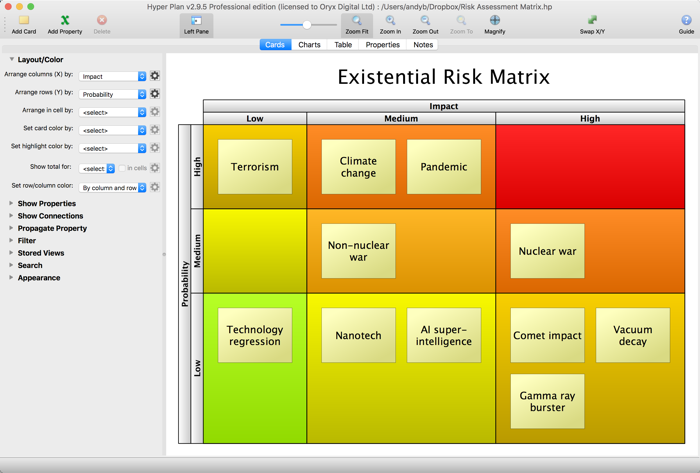 Example Risk Assessment PI Matrix
If you haven’t already got Hyper Plan software installed, you can download a free trial here. It should only take you a minute to download and install. When you are prompted which edition of Hyper Plan to try, choose either Home or Professional Edition.
Start Hyper Plan. Create a new file by selecting File>New. Choose a name for the new plan file, e.g. “Risk Matrix”.
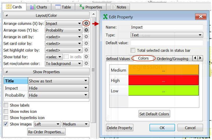
In the New Plan Properties window leave the Title property checked. Click the Add Property button and add two new properties Impact and Probability with Type set to Text and Pre-defined values of Low,Medium,High. Set Impact to displayed as Card columns and Probability to be displayed as Card rows.
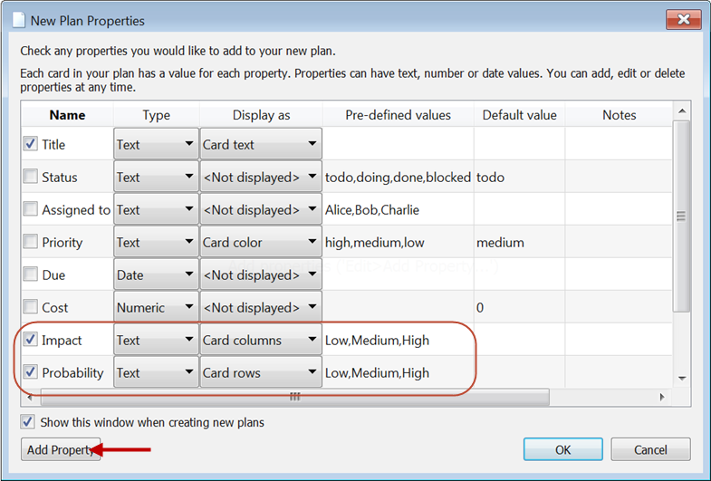
Click OK.
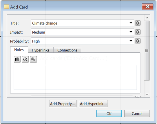
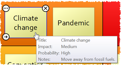
Lets create an existential risk assessment for humanity as a cheery example. Click on the Add Card toolbar button, fill out the card as below and click OK.
A single card should now be visible in the Cards pane. Now add some additional cards.
Note that you can add a card to a cell by clicking on the + overlay that appears when you hover over the cell (as long as View>icon overlay is selected.
You can easily drag a card to a different row or column if you change your mind. The rows and columns are resized automatically. Double-click on a card to edit the title.
Lets improve the appearance a bit. Click on the Impact properties button and change the colors associated with High, Medium and Low to red, orange and green, as shown below.
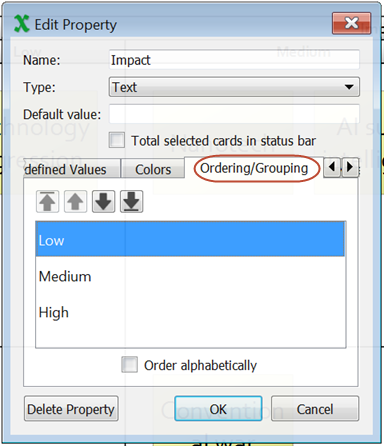
Make sure the values are ordered how you want them, using the up and down arrows.
Click OK.
Repeat the process for Probability.
Then set Set row/column color to By column and row.
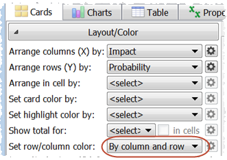
The cells should now be colored according to Impact and Probability. Green=low risk, red=high risk.
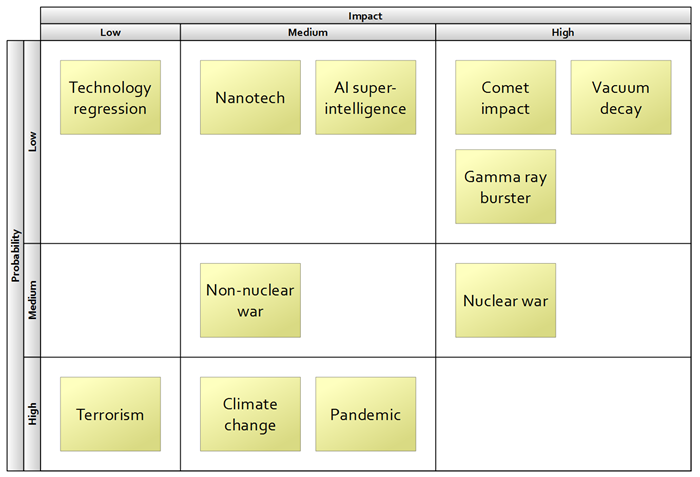
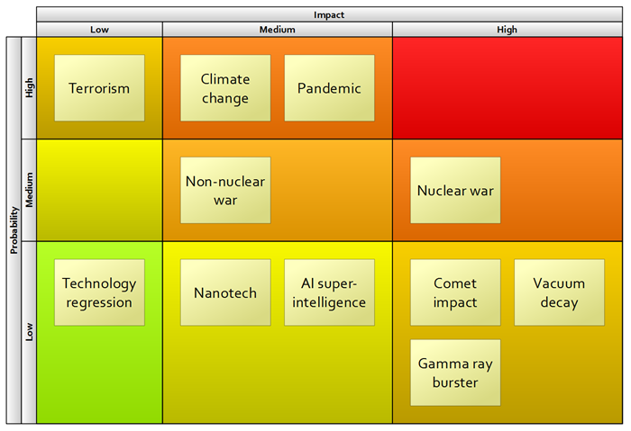
Some Risk Assessment Matrices are shown with Impact=High and Probability=High in the top right corner. We can easily change the row order by dragging rows. Click on the High row, drag it to the top and release.
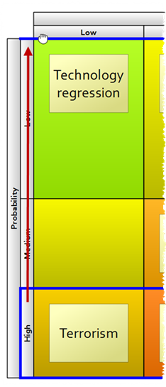
Then drag Low to the bottom.
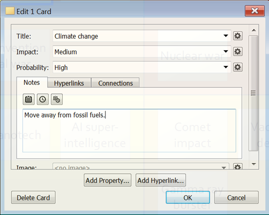
Finally we might want to look at how we can mitigate each risk. Double-click on one of the cards and write how we can mitigate the risk in the Notes field.
When you hover over the card the properties values and the notes are shown (as long as View>Card Tool Tips is checked).
You can also add additional properties. For example, you can add an Assigned property that you can use to track who is responsible for monitoring or mitigating each risk.
Obviously this is a very simple Risk Assessment matrix, but there is no limit to how many cards you can add or how many rows and columns you can have. For example you could have a 5x5 Risk Assessment Matrix by changing the Impact rows from Low/Medium/High to Negligible/Minor/Major/Hazardous/Catastrophic and the Probability rows from Low/Medium/High to Impossible/Unlikely/Possible/Likely/Highly likely.
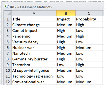
If you have your risk information in a CSV file, you can import it so that you don’t have to re-type everything. Just select File>Open and set the file type to CSV Files. Note that you can File>Save As… from Microsoft Excel to create a CSV file.
Once you are happy with your Risk Assessment Matrix you can File>Print… or File>Export it.
Hyper Plan is very flexible. We have only scratched the surface of what it can do. Have a play!