Don’t Panic!
This guide should only take a few minutes to work through. Hyper Plan is powerful and flexible, but you only need to know some basics to get started. If you have ever planned something by sticking colored notes to a wall, then you already understand most of what you need to know.
Concepts
Hyper Plan is a based on a few simple concepts:
Cards: Typically you will want one card for each task or item in your plan. For example, you might want a card for “get a quote for website design”.
Properties: Every card in a plan has the same set properties. For example, “Title”, “Duration”, “Cost”, “Status”, “Person assigned to” or “Due date”. You can have as many or as few properties as you want. Choose whatever properties are important to you in your planning.
Values: Each card has a value for each property. Values can be dates (e.g. “1/2/2015”), numbers (e.g. “10”), text (e.g. “urgent”) or empty.
Layout and color: Hyper Plan can lay out and color cards in lots of different ways, according to their property values. For example, you can layout cards in columns by their status, rows by who they are assigned to and color them by their priority.
Filters: You can control which cards are visible using filtering.
Totals: Display totals for any property by row and column. For example, you can total the estimated effort by person assigned and by task status. A bit like pivot tables in Excel®, but much easier!
Charts: Create bar charts, sliced and diced in various ways. For example, the amount of effort assigned per person by category.
Connections: Show relationships between cards.
Open a sample
Let’s open a sample plan and have a play.
Select File>Open and choose the project plan sample that was installed into your Documents/HyperPlan folder.
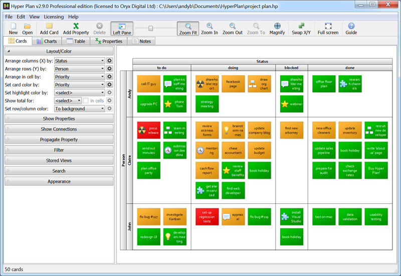
Here we have a card for each task:
- The card column is set by the value of the “Status” property for each card: to do/doing/blocked/done.
- The card row is set by the value of the “Person” property of each card: Andy/Claire/John.
- The card color is set by the value of the “Priority” property: red=high/orange=medium/green=low.
- The text displayed on the card shows the “Title” property value.
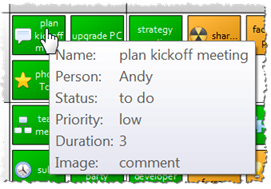
If you hover over a card, a tooltip will appear with all the property values for that card.
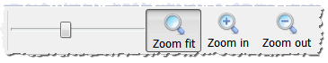
The plan will be zoomed back to show all the cards while Zoom fit is pressed in. You can also zoom in/out on the cards using the zoom buttons, the zoom slider or the mouse wheel (if you have set the mouse wheel to zoom in the Preferences window).
Editing
Double-click on one of the cards in the “doing” column to edit it and change the “Status” drop-down list to “done”.
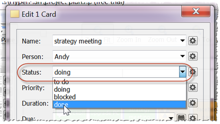
Click OK and notice how the card moves to the “done” column.
Select a card and drag it to a different row and/or column. Double-click on the card and notice how the “Status” and/or “Person” “properties of that card have been updated.
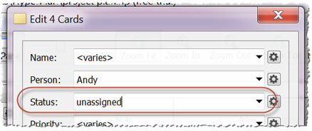
Click away from a card and drag out a rectangle to select multiple cards. Select Edit>Edit Card(s)… from the main menu and type in their “Status” property as “unassigned”. Notice how a new column is created for the “unassigned” cards.
Note that you can also select multiple cards using Ctrl+click (Windows)/Cmd+click (Mac).
If you are dragging multiple cards holding down the Ctrl (Windows)/Cmd (Mac) key and dragging horizontally preserves the column values of the cards. Similarly holding down the Ctrl (Windows)/Cmd (Mac) key and dragging vertically preserves the row values of the cards.
Layout and color
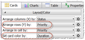
You can slice information in multiple ways. In the Layout/Color section of the Left pane:
- Change the Arrange rows (Y) by drop-down list from “Person” to “Priority”.
- Change the Set card color by drop-down list from “Priority” to “Duration”.
The cards are now colored according to their duration. We can change the colors used by clicking on the small button next to the Set card color by drop-down list. Currently minimum duration tasks are shown in red and maximum duration in green. Click on the red and green color buttons in the Colors tab to use different colors. For example, light blue and dark blue.
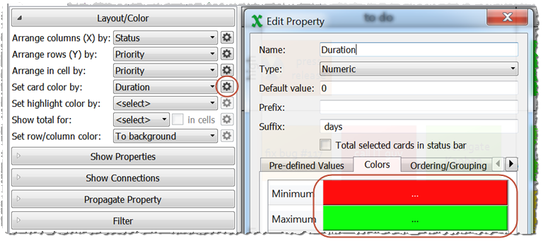
Click OK when you are done. Notice how the colors change.
Show properties
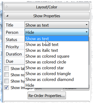
You can control which properties appear on the card in the Show Properties section. Try it.
Ordering
Now let’s change the priorities so that “low” is shown as the top row and “high” as the bottom row. Click the small button next to the Arrange rows (Y) by drop-down list. Change the order in the Ordering tab by selecting “high” and “low” and re-order them using the up and down arrows.
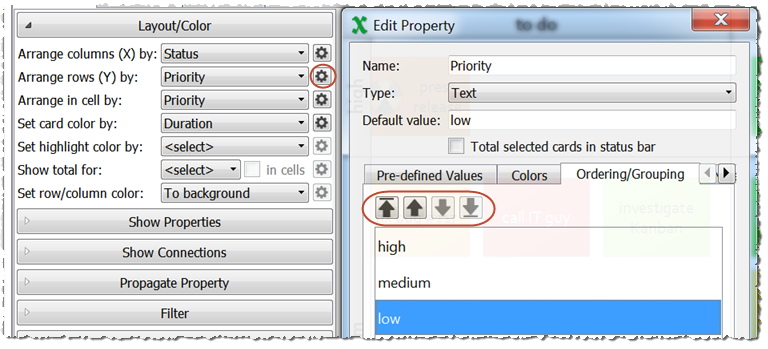
Click OK when you are done. Notice how the row ordering changes. You can also change column or row ordering directly in the Cards pane by clicking on column/row headers and dragging. Try it.
Pre-defined values
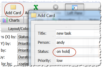
The “Status” columns are defined by the “Status” values of all the cards. This means that adding a new card with status “on hold” will create a new “on hold” column. Try it. Click Add card, set Status to “on hold” and click OK.
Now select the newly created “on hold” card and select Edit>Delete from the main menu to delete it. Notice that the new “on hold” column also disappears. Now select Edit>Undo to undo the card deletion.
You can make “on hold” a pre-defined value so that the column is always displayed, even when it is empty. Right-click on the “on hold” column header and select Show this column if empty.
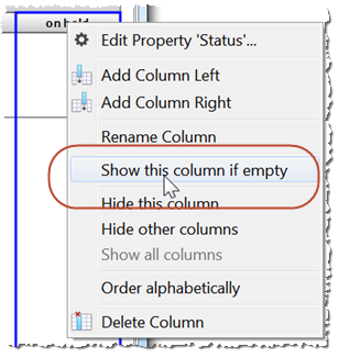
If you delete the “on hold” card again the empty column should now remain visible.
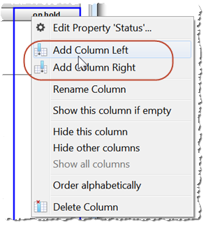
You can also add pre-defined values by right-clicking on a column header and selecting Add Column Left or Add Column Right from the pop-up menu. Similarly for rows.
Totals
Now let’s total the duration by “Status” and “Priority”. Change the Show total for drop-down list to “Duration”.
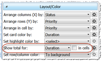
Gray rectangles are now shown with the total duration for each row and column. Check in cells to also show totals for each cell. Zoom in or use the magnify cursor if you can’t read them easily.
Change the Arrange columns (X) by drop-down list from “Status” to “Person”. Notice how the totals update. The totals will also update if you drag cards between rows and/or columns.
Filtering
Let’s hide all the “done” tasks. In the Filter section of the left pane, set the drop-down list to Hide and type in “done”. All the cards that have status “done” will be hidden (also any cards with “done” in another property or in their Notes field).
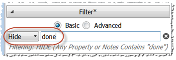
Use the Ctrl+F (Windows)/Cmd+F (Mac) shortcut to toggle the Filter section open/closed.
The Charts Pane
You can display bar charts in the Charts pane with a few clicks.
- Click on the Charts tab.
- Set the Show drop-down to “Duration” to set bar height to the total duration.
- Set the By drop-down to “Status” to show a bar for each status.
- Set the Per drop-down to “person” to show a chart for each person.
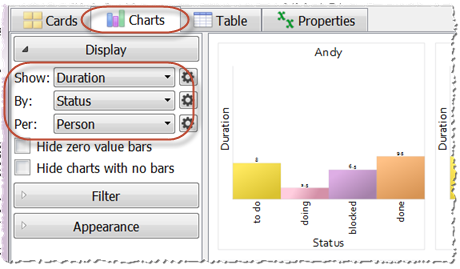
You can change the appearance of the chart in the Appearance section of the Charts pane.
The Table Pane
You can also edit your data in the Table pane.
Currently the rows are colored by the status of each card. You can change this in the Appearance section.
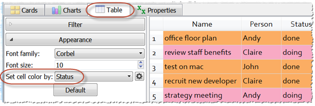
Note that changes in the Table pane update the Cards and Charts panes (and vice versa). Try it.
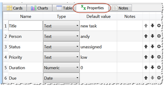
The Properties Pane
You can see, edit and re-order all the properties in the Properties pane.
Adding new cards and properties
To add a new card either:
- select Edit>Add card; or
- click the Add Card toolbar icon; or
- use the Ctrl+I (Windows)/Cmd+I (Mac) shortcut; or
- Alt+Left-click (Windows)/Option+Left-click (Mac) on a cell in the Cards pane.
- press the Tab key in the last cell of the Table pane
To add a new property either:
- select Edit>Add property; or
- click the Add Property toolbar icon; or
- use the Ctrl+Shift+I (Windows)/Cmd+Shift+I (Mac) shortcut; or
- press the Tab key in the last cell of the Properties pane
You can set the property Type to Automatic, Text, Numeric or Date. If you choose Automatic Hyper Plan will infer the type as Text, Numeric or Date from the values. All existing cards will have the new property value set to the Default value.
Connections
Connections can be used to show relationships between cards, including: sequencing (e.g. A before B) and hierarchy (e.g. X comprises Y and Z). Connections are only available in Hyper Plan Professional Edition. See the Professional Edition documentation for more details.
Starting a new plan
Select File>New to create a new empty plan. Try adding your own cards and properties.
We’re done!
Have a play and see what else you can find out. Happy planning! ;o)
Once you are a bit more familiar with Hyper Plan, then please check out the expert tips page. This has information on:
- Images
- Magnification
- Icon overlay
- Searching
- Stored views
- Printing and exporting
- Opening CSV files
- Dates
- Quick add
- Multiple-user/multiple-computer environments
- Running from a memory stick
- Keyboard shortcuts
- Drag and drop
We also have ‘How to’ articles for various topics:
- Create a Kanban Board
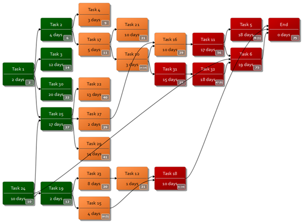
- Create a PERT chart
- Create an organization chart
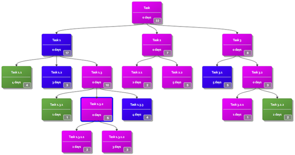
- Create a work breakdown structure
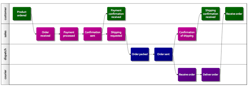
- Create a swim lane diagram
- Create an interrelationship diagram
- Create an affinity diagram
- Create a SWOT analysis
- Create a risk assessment matrix
- Create a timeline
- Create a pivot table
- Track your sales pipeline
- Present your plan
And a frequently asked questions page.
Excel is a registered trademark of Microsoft Corporation